ROB GOYANES AND DAVID ELIA IN CONVERSATION

In October 2023 writer Rob Goyanes and David Elia met for an online conversation about art, landscape and environment and talked about sources of inspiration from the light of Rio and the South of France to Color Field painting and Jacques Tati.
Rob Goyanes Let’s talk about your studio in Monaco — you have a lot of design pieces in the space.
David Elia I collect mid-century design: Scandinavian, Italian, French. I get a lot of inspiration from that era. There’s a theme when I collect, it’s really about nature, organic materials, shapes. I’m really attracted to geometry and mathematical elements too.
Q It helps to be surrounded by beautiful objects.
A It really appeals to me, the decorative aspects of contemporary and modern art. I look a lot at the Pattern and Decoration movement, as well as color field painting. I recently discovered the work of Alma Thomas from the Washington Color Field School, which really spoke to me.
Q I’m curious about your personal relationship with the forest. Growing up in Rio in the 1980s and ’90s, what was the cultural attitude toward the forest at that time? How did it impact your sense of self and aesthetics?

A When you’re in Rio, you’re completely immersed in the tropical environment. It’s very exuberant. As a kid I was always playing outside, I’m a very outdoors person. My friends, all their homes were in the middle of the forest. There were constantly forests all around me. I left Rio for the South of France when I was 7 years old. I would go back once a year, we still had a home there and some family and close friends. Having those two sides of the environment really informed my work in different ways. We visited the South of France a lot. I recognized the special light there that artists often talk about. Cezanne and Matisse always spoke about how the light was very conducive to their work, that luminous quality. The light in Rio, it’s a different kind of light, it’s stronger, yet the sky is much darker. The light that interacts with the green of the forest is so strong that the sky becomes even more blue, a very strong blue.
Q How do your experiences from Brazil relate to your recent design projects?
A The past ten years, I was focused on furniture, looking at different issues in Brazilian society that I then interpreted through the works. I did projects that dealt with security issues, like stray bullets and urban infrastructure. There’s flooding in Rio often, so I made a decorative terracotta plate, poured resin into it and inserted Havaiana sandals, to convey the fact that people often have their feet underwater. I also played with the ideas of diversity and cultural hybridization by making these Brazilian stew pots that were broken into pieces then built up again, each piece covered with fabric and sewn together without glue.

Q Do you distinguish between your art and design practices? And why do you think you’re returning more forcefully toward art at this moment?

A There is a line that connects everything, which is the focus on environmental issues. In 2018 I represented Brazil at the London Design Biennale, and the theme I decided to tackle was deforestation. I made stools for the installation using bundles of Eucalyptus wood, with the blue strip along the bottom. When the pandemic happened, I left London and went back to Monaco. This is when I decided I was going to do more two-dimensional painting. I felt like, at the end of the day, it’s possible to be multidisciplinary. Many designers that I admire, like Oscar Niemeyer, Roberto Burle Marx and Athos Bulcão were great artists as well as designers. All of this really made me want to pursue the art aspect, more than sculpture or three-dimensional work. For now.
Q Your recent work includes cyanotype photography, depicting the Amazon forests. What does that medium accomplish that others can’t? How does the history of this technology tie into the place?
The works on paper are representational, they’re photos of the forest using the cyanotype. It’s the idea of a portal into the forest. The iconography of the 19th century, those European botanists and artist-adventurers who went there, that’s what I was trying to evoke through those pictures. They also have a theatrical aspect which I find interesting. In the abstract dotted paintings on canvas the colors all belong to Werner’s Nomenclature of Colors. Each color was taken from a specific element found in nature by Abraham Werner, a 19th century German mineralogist. It was interesting to integrate that with the cyanotype. I apply the cyanotype the way paint is applied to canvas. It allows me to play with positive and negative space, by placing masking tape, or grids, on top of them. It allows me to build up layers.
Q Dots, grids, and other patterns show up often in your art.
A For me, the dots represent a topographical view of the forest canopy. It’s how one would draw a tree from the top at its most basic shape. Looking at landscape architecture is critical to my work. One of my degrees was in architecture, so that influenced me a lot, the discipline’s technical aspects. I get inspiration from patterns from all over the world: the Aztec Nazca lines, aboriginal and African art and patterns. I’m also inspired by patterns from the Marajoara culture, a pre-Columbian civilization that existed in the Amazon.

Q You combine these patterns with a strip of Klein blue at the bottom. It’s a dialogue with the history of abstraction, but also references the strip of paint put on trees to denote that they will not be cut down.
A I’m a bit obsessed with this blue. I think it’s very interesting to see how all the colors above the strip interact with this ultramarine blue . It’s sort of a Rothko-esque analysis, seeing how they go along with each other while triggering different emotions and moods. It holds up the composition, like there’s some sort of a weight that holds everything in place. Some people ask me: Why do you leave so much white around it? It’s just to allow the whole composition to breathe, to really be able to see all of the colors interacting with each other. I didn’t want it to be too overwhelming. The works in the Pattern and Decoration movement, they take up the entire canvas, from edge to edge. I didn’t want to go in that direction. Also, the grids break up the roundness of the dots. They remind me of the nets used to protect trees in agriculture, and I also use screens to cast a shadow when I do the cyanotypes developed under UV light. This is the sort of vocabulary that I’ve developed.
Q I’d love to talk more about the idea of gambiarra, how you define it and the role it plays in your art.
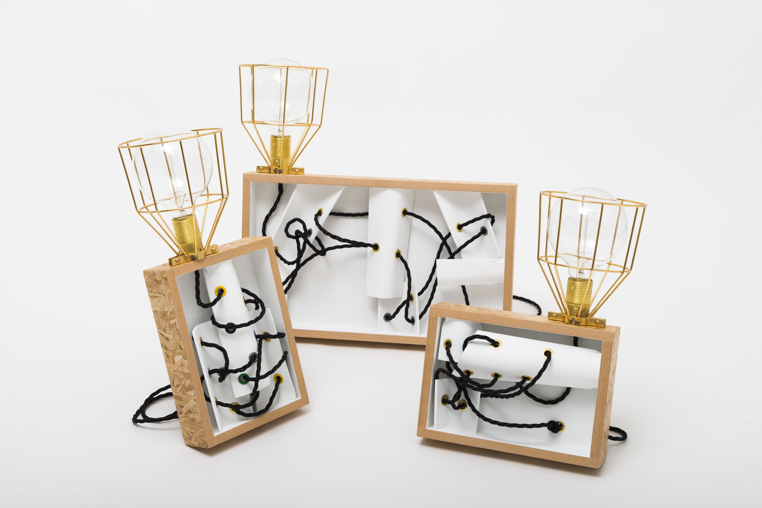
A In Brazil, gambiarra is a way of improvising things, putting things together with whatever you have around you. It’s very spontaneous, and you see everything, all the elements are in front of your eyes. Usually, it’s not aesthetically pleasing. I did a few projects that showcased this idea. I made the GATO lamps with exposed electrical wires, inspired by how, in the favelas, they connect the main electrical supply of the city with their homes and it creates a bundle of wiring. For another project, I was inspired by the kids within Brazilian communities who fly kites. They do battles with them, try to cut each other’s lines. They mix glass powder and paraffin and put it on the lines so it becomes sharper. For them, it’s a way to escape a harsh reality. I made a side table using an exaggerated wooden reel, like the kind used to fly the kites and placed it on top of a chair’s wheelbase. There’s a parallel between the idea that you make do with whatever you have, with the ideas of Dada, Duchamp, and found objects—that you put things together and it’s a sculpture. I navigated those ideas of art but combined it with design, so they ended up as functional sculptures.
Q Are the paintings planned out? Do you have a vision for the work beforehand?
A I juggle a little bit. It’s important to be spontaneous, and just go with whatever idea you’re having at that time. Just go for it. But sometimes I do preliminary drawings, and I plan out how I want to do it, especially if I feel that something special is going on. But sometimes I just want to test a new set of brushes that I find interesting, like these much more coarse ones that I used recently. My work is a result of real trial and error, and testing. Recently I did a cyanotype with coarse salt on top of it. The grid is an acetate sheet. I put it on top of the cyanotype ink, and when it develops, the grid leaves a trace, a shadow, a footprint.
Q I love the effects of the cyanotype interacting with the salt, it almost looks like watercolors.
A I feel it gives it more of an organic aspect. On some of them, it creates an interesting pattern, almost like a leopard motif. I did another project inspired by slices of Brazilian agate stones, involving prints made by combining two different techniques: ebru, which is a Turkish technique to create a marbling effect, and Suminagashi, a Japanese marbling technique. Both involve painting on water. They’re made of concentric circles. I’m able to control the paint by blowing on the edges to give this shape or using little pipettes to blow. Also, the water needs tension, so you’re using this special kind of algae powder called Carrageenan that turns the water into more of a gel-like substance. One of the designs ended up being made into a rug by a company in Milan, and it was used in the Barbie movie.

© 2023 Warner Bros. Entertainment Inc. Used with permission of Warner Bros. Pictures
Q Incredible, which scene was it in?
A It’s in Weird Barbie’s house, when she does a split. I was really surprised! I love being able to collaborate with the movie industry. In fact, my latest work was inspired by films like Playtime by Jacques Tati, and Technicolor classics like Black Orpheus by Marcel Camus and The Red Shoes by Pressburger and Powell. Another design project, which hasn’t been realized yet, is with vases shaped like statistical pie charts showing different types of materials being recycled in Rio. I use lithology patterns. In geology these patterns are used to differentiate the many stratas of the earth in a cross section drawing, the different types of stones.
